Rome Program Promotion
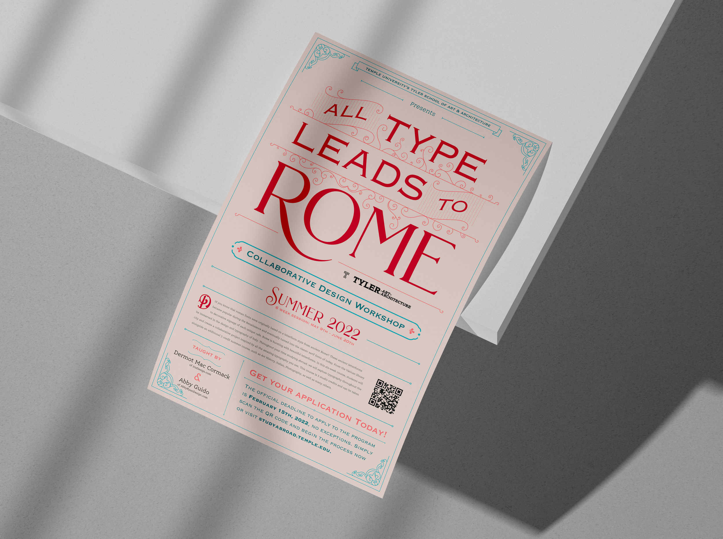
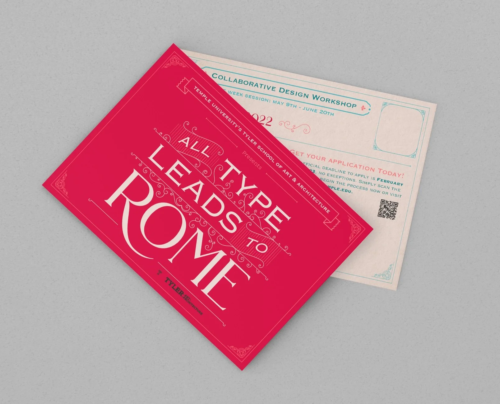
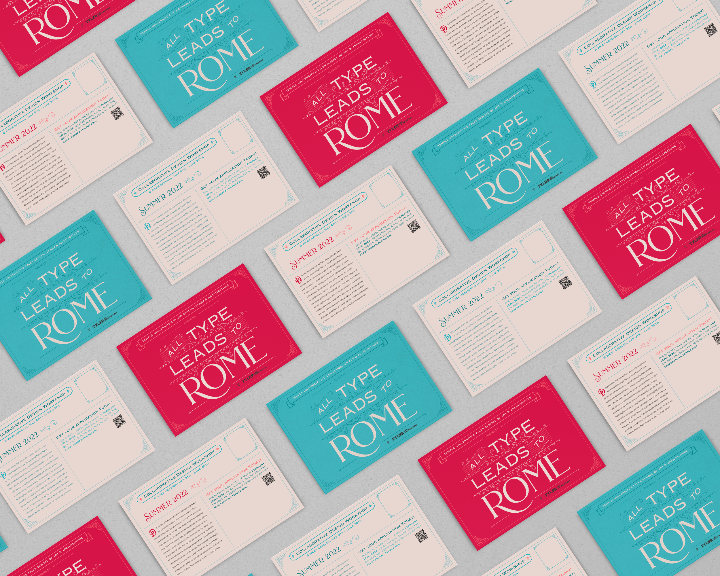
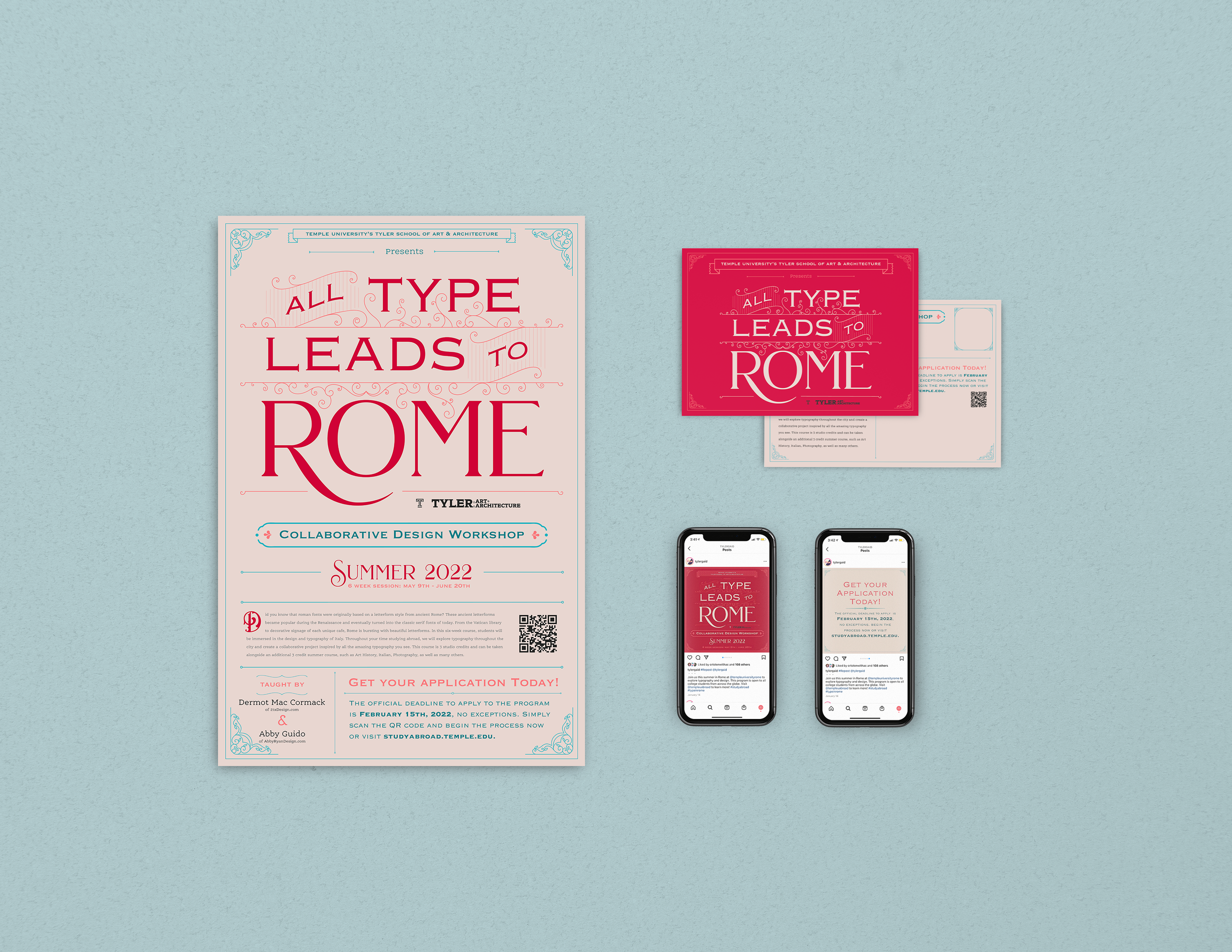
All type really does lead to Rome. Oh and of course the roads too. During my time working as a General Designer at Tyler’s Graphic and Interactive Design studio, I was called upon to design the promotional material for Temple Rome’s Collaborative Design Workshop on Typography. I was responsible for designing the promotional materials such as posters, postcards, and social media deliverables, as well as coming up with the promotion’s name.
As a typography lover, I was absolutely thrilled to be designing typographic-based material with decorative elements. Much of my style inspiration came from the many signs that can be found in the city of Rome, specifically those from the late 19th century. I’m a sucker for tiny details, dainty ligatures, and vintage letterforms so this was right up my alley.
I could not even talk about this project without mentioning the work of Louise Fili, a graphic designer who specializes in packaging and brand development. Her work is so reminiscent of European typographic styles and she is someone who had a major impact on the elegant quality of this project.